
Colour Palettes Pulled from Old Book Covers

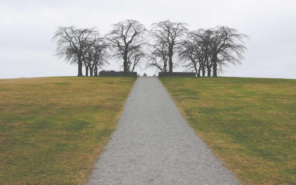
The second-hand bookshop down the road is our favourite colour reference. Nothing there is quite the colour it used to be.

We try to write for one specific reader. When a paragraph confuses that imaginary person, it usually confuses everyone else too.
Good tools disappear. The ones we keep are the ones we stop noticing, because they do exactly what we expect every single time.
Continue reading
Related posts
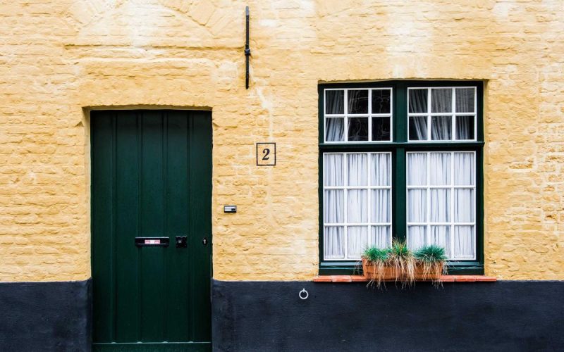
What a Paper Prototype Still Teaches
Scissors, tape, and index cards expose design problems faster than any tool.

Designing Around a Single Photograph
Letting one strong image set the palette, grid, and tone.

Kerning Pairs We Fix on Every Project
The awkward letter combinations that always need a nudge.
Comments · 0